
AI Report Summaries
Designing a self-serve AI report summary that replaced a manual request — 21.1% adoption in 90 days.
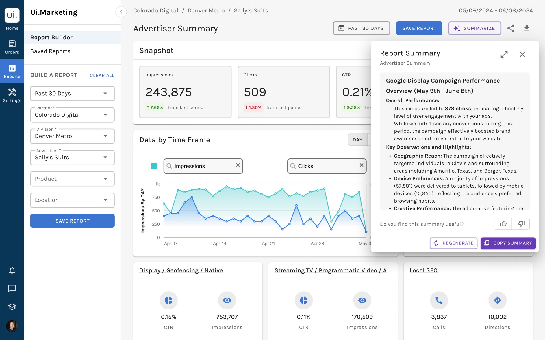
Report viewers — the external partners who receive campaign reports — often asked for a short summary alongside the full report. Producing those summaries by hand fell to internal teams. By automating them with AI, we gave report viewers a way to see performance for themselves and took the manual writing off internal teams.
As the sole product designer on this project, I led user flows, wireframes, prototyping, and usability testing. Working closely with the product manager and engineers, I completed the design within the two-week timeline, and the feature launched in October 2024.
Problem
Every summary meant waiting on someone else.
Report summaries weren't self-serve: each request went to our internal team, who wrote them by hand. It could take hours, or even days, to synthesize and interpret numbers that were already in the report.
Goals
Help report viewers understand performance data without having to ask.
Our goal was to deliver AI-generated summaries directly within the reporting workflow, eliminating manual requests and making performance highlights available the moment report viewers needed them — without leaving the report.
Solution
Generate a summary in one click, then copy or regenerate it.
Report viewers trigger the summary from the report they're already looking at. Once it's there they can copy it to use elsewhere, regenerate it if the report has changed, and rate whether it was useful.
Outcome
21.1% of report viewers generated their own summary within 90 days.
Within 90 days of launch, 21.1% of report viewers generated a summary themselves, against a 20% target. A summary that used to require a request and a wait became something a viewer could get on demand.
Understanding
How might we introduce AI summaries without disrupting the reporting experience?
As this was a new AI feature within an existing reporting experience, I first clarified the requirements and explored how it could integrate seamlessly into the current workflow before creating wireframes.
Four requirements, and two open questions
The product manager's PRD set four requirements for the summary:
📊 All Report Levels
Generate summaries at every reporting level.
🔄 Copy & Regenerate
Copy or regenerate summaries anytime.
👀 Continuous Report Access
Navigate reports with the summary visible.
👍 Summary Feedback
Rate the usefulness of generated insights.
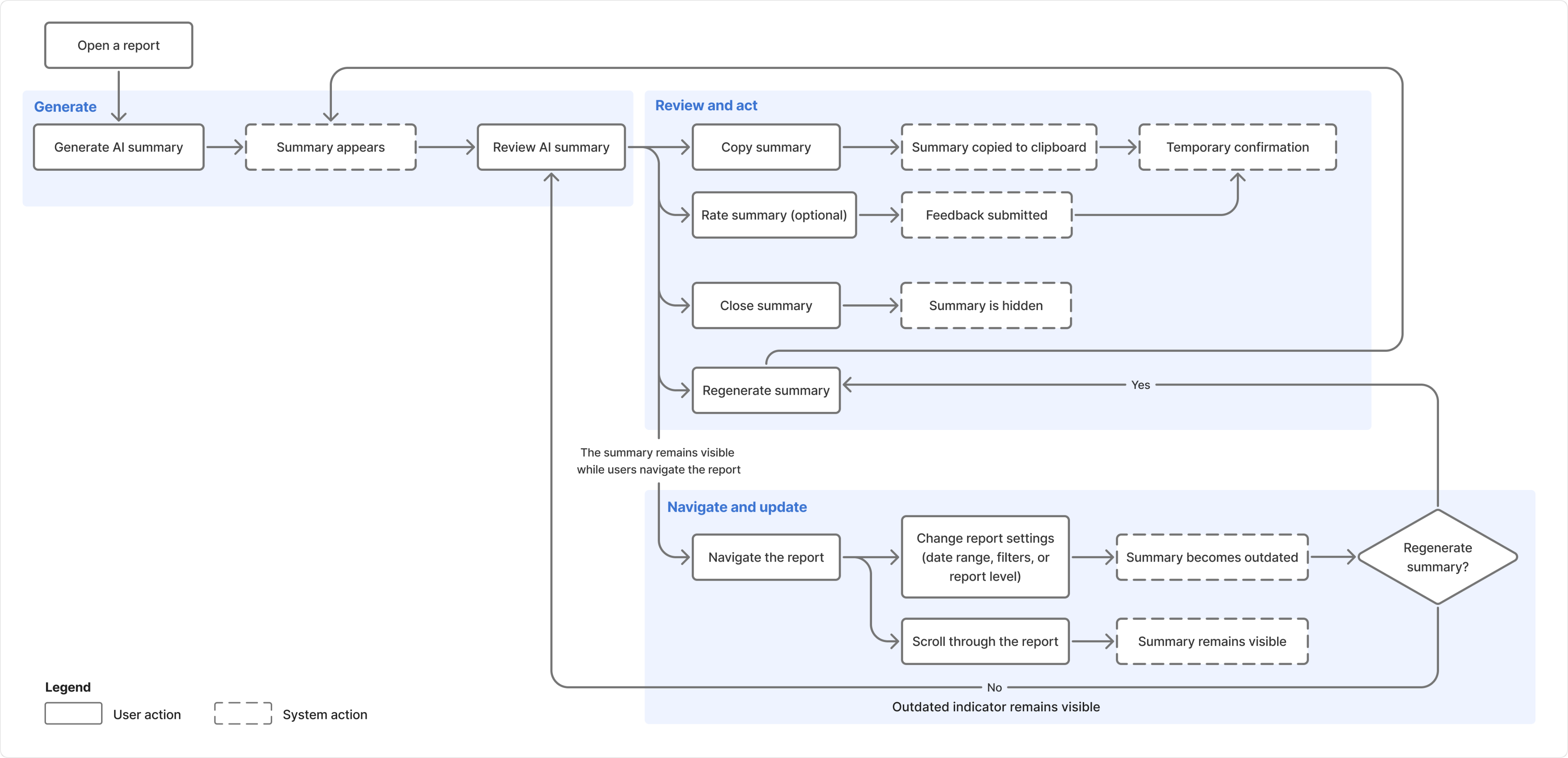
With these priorities established, we mapped the end-to-end user flow and identified two central design questions:
- How should report viewers initiate summary generation?
- Where should the AI-generated summary appear within the report?
Mapping the End-to-End User Flow
Exploration
Comparing interaction patterns for generating and viewing AI summaries.
The questions identified during kickoff guided my exploration of four approaches for generating and viewing the summary, each built from patterns already used elsewhere in the product.
Option 1Persistent drawer
An icon button opens a persistent drawer.
Trigger toolbar icon
Surface drawer, right edge, full height
Option 2Floating window
An icon button opens a movable window.
Trigger toolbar icon
Surface floating window, over content
Option 3FAB and floating window
A FAB opens the floating window.
Trigger floating button, bottom right
Surface floating window, over content
Option 4Inline summary
The AI summary appears at the top of the report.
Trigger inline button, top of report
Surface block in the page, pushes content down
I ranked the four concepts on report access, trigger discoverability, and ease of build — in that order. Report access came first because report viewers needed to check the summary against the data while reading it.
| Rank | Approach | Report Access | Discoverability | Ease of build | Rationale |
|---|---|---|---|---|---|
| 1 | Icon button → Persistent drawer | High | Low | Low | Harder to discover and requires major layout changes, but provides the strongest access to report data. |
| 2 | FAB → Floating window | Medium | High | Low | Highly discoverable and supports report navigation, but requires significant effort to introduce a new floating-window component. |
| 3 | Icon button → Floating window | Medium | Low | Low | Hard to discover and costly to build, while obscuring some report content. |
| 4 | Inline summary | Low | High | Medium | Easy to discover and moderately complex to build, but disappears as report viewers scroll through the report. |
Reevaluating the concepts after engineering review
A design review with engineers removed one concept and forced a rethink of another: FABs were being phased out across the app, and the persistent drawer needed significant changes to the existing report layout. Since navigation and filtering already lived in the side navigation, the engineering lead suggested it as another entry point — so I sketched a sidebar concept.
Option 5Side navigation
A labelled side-nav item expands a panel in place.
Trigger labelled item in side nav
Surface panel inside the side-nav column
I dropped the FAB concept, re-scoped the drawer as an overlay — which removed the layout work, but cost it the continuous report access that had ranked it first — and re-ranked the remaining four against the same priorities: report access first, then trigger discoverability and ease of build.
| Rank | Approach | Report Access | Discoverability | Ease of build | Rationale |
|---|---|---|---|---|---|
| 1 | Side navigation button → SidebarTo test | High | High | High | Uses an existing, labeled pattern and keeps report content accessible, but its narrow width may limit readability. |
| 2 | Icon button → Floating windowTo test | Medium | Low | Low | Supports report navigation, but overlaps content and requires custom behavior. |
| 3 | Inline summary | Low | High | Medium | Easy to discover and moderately complex to build, but disappears as report viewers scroll through the report. |
| 4 | Icon button → |
Low | Low | Medium | Difficult to discover and limits access to the underlying report, though the overlay avoids the drawer's layout work. |
| Removed | FAB → Floating window | Medium | High | Low | Removed because FABs were being phased out across the app. |
The side-navigation concept combined high discoverability, a high ease of build, and continuous access to report data, but its narrow width could limit summary readability. The floating window kept the summary visible while report viewers navigated the report, but it could obscure underlying content. Because both concepts offered distinct strengths and tradeoffs, I moved them forward for usability testing.
Testing
Testing the two strongest concepts: Sidebar vs. Floating window.
Due to the project's tight timeline, we were unable to recruit external users. Instead, I conducted a one-day, unmoderated Maze test with 35 internal users to compare the two strongest concepts and gather feedback on their preferences.
Floating-window Option
Sidebar Option
The floating window concept won
The floating window scored 6.5 of 7 on SEQ — 0.9 above the sidebar — and won the preference vote 18 to 12. Participants found it easier to read and said it kept the side navigation uncluttered.
However, several participants struggled to recognize the icon-only trigger, so I paired the icon with a text label to improve discoverability. Participants also surfaced the need for an optional feedback field, letting report viewers explain their ratings and helping the team uncover opportunities to improve future AI-generated summaries.
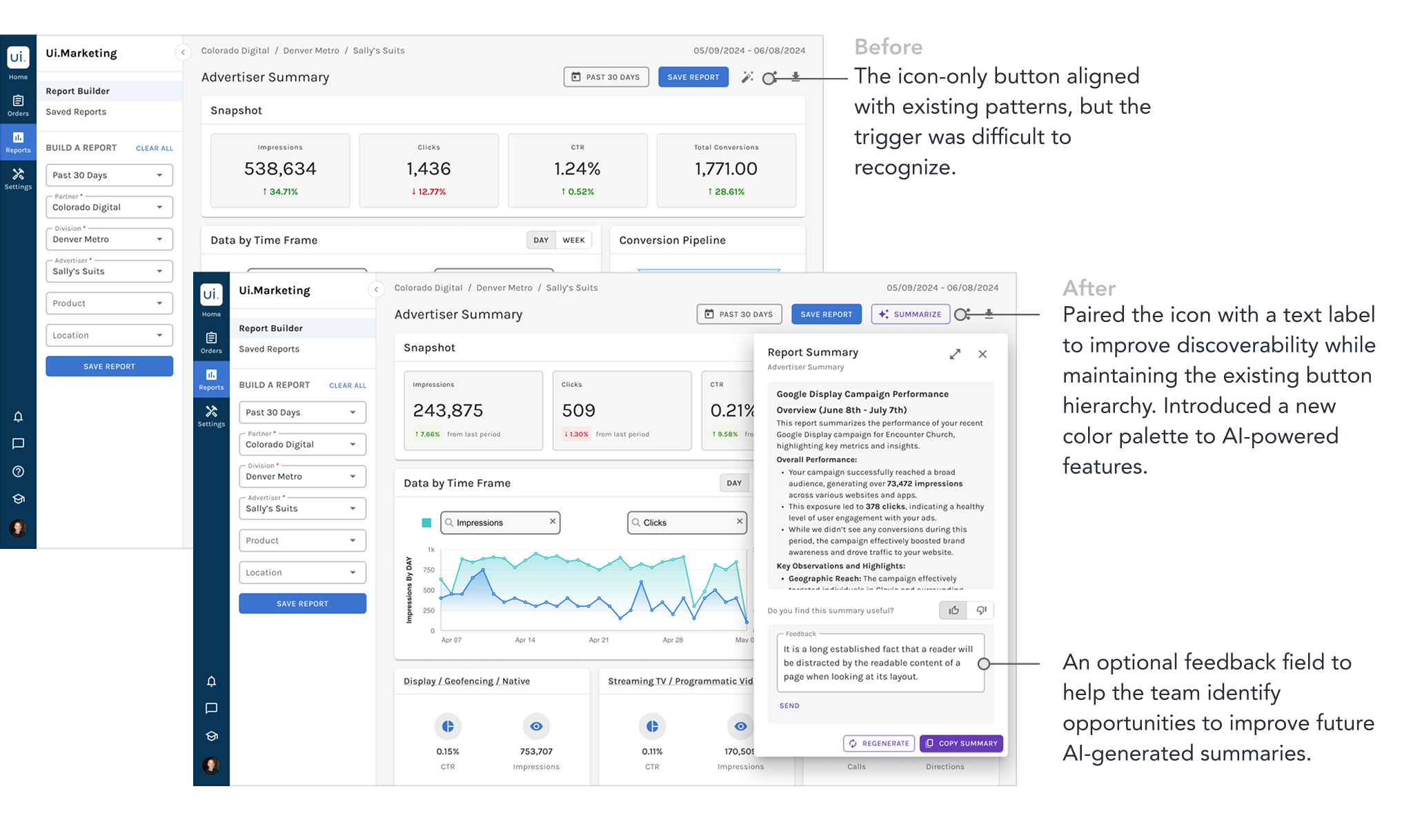
I had ranked the floating window below the sidebar. Two of my three objections to it didn't hold — a text label fixed discoverability, and participants cared more about readability than about what the window covered. Only the build cost survived.
Ranking got me to the right two. Testing told me which one.
Designing for the Model
I couldn't make the model right. I could make it checkable.
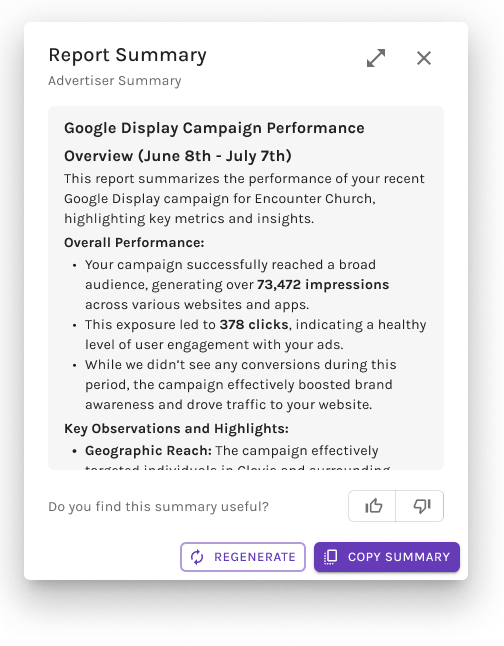
Placement was only half the problem. The product manager gave me example summaries to design around, and every one of them made claims about numbers sitting a few inches away on the same screen. I couldn't stop the model being wrong, but I could make each claim cheap to check: every metric the summary cites is set in bold, and the window it lives in moves, so a report viewer can put a sentence next to the figure it came from. The rest of the work was the states around that — what the window shows while a summary is generating, what it does when the report changes underneath it, and how it fails.
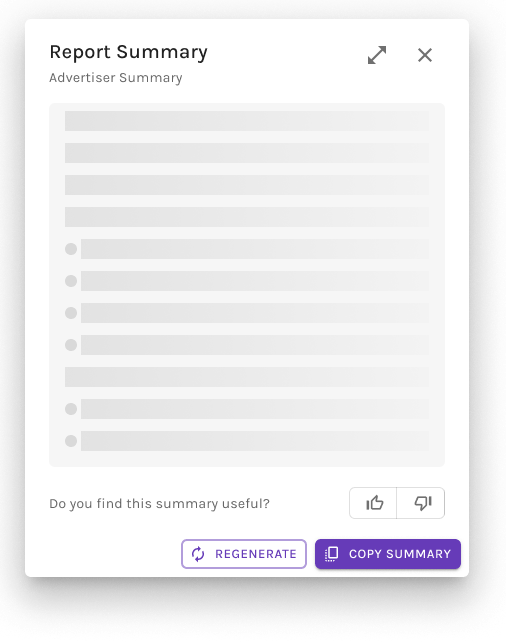
Generating
A skeleton holds the window's shape while the summary is written.
Generated
The finished summary, with every metric it cites set in bold.
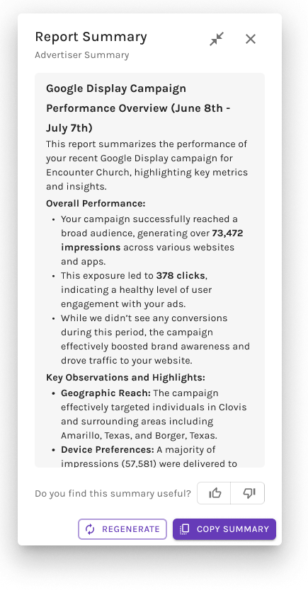
Expanded
A wider view for reading the whole summary without scrolling the panel.
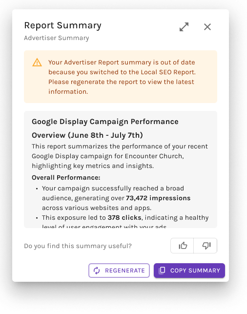
Outdated after report changes
Switching reports marks the summary stale and prompts a regenerate.
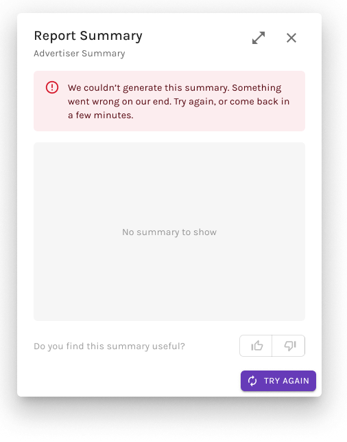
Fail to generate
Nothing to rate or copy, so the panel collapses to a single Try again.
Final Design
A flexible AI summary experience that keeps report insights within reach.
The shipped summary launches from a clearly labeled button in the report toolbar, addressing the discoverability issue uncovered in testing. The button carries the icon and accent color our AI features share, so the summary reads as part of that family rather than as an unexplained new control. It opens in a movable, resizable window so report viewers can check the summary against the numbers it cites. From there, they can copy, regenerate, and rate the summary, with an optional feedback field. The same experience works consistently across every report level.
Reflection
Rank the options after talking to engineering, not before.
I explored and ranked four concepts before a design review reshaped the set: it eliminated one, re-scoped another, and introduced a fifth that went on to testing. An unscoped layout cost and a pattern already being retired — neither was visible from my ranking, and both were one conversation away. I'd bring engineering in before the ranking now, not after it.
Next Steps
Validate with a broader user base and understand what drives or limits adoption.
Because the timeline limited testing to 35 internal users, my next step would be to validate the experience with a larger, more representative sample of report viewers. While 21.1% adoption was a strong start, I would investigate why other report viewers did not use the feature — whether because of discoverability, trust, relevance, or simply a lack of need — to identify opportunities for future improvement.